Introduction
In the realm of art, Impressionism holds a special place due to its innovative use of color to capture the fleeting nature of light and atmosphere. The Impressionists, including celebrated artists such as Claude Monet, Pierre-Auguste Renoir, and Édouard Manet, developed a unique approach to color that marked a significant departure from traditional painting rules. To appreciate the depth of this movement, it’s essential to delve into the science of color in Impressionist paintings.
The Optical Mixing of Color
A key aspect of the Impressionist color theory was the principle of optical color mixing, also known as “broken color.” Instead of mixing pigments on a palette to form the desired color, Impressionists applied individual strokes of pure, unmixed color side by side on the canvas. When viewed from a distance, these strokes would blend optically in the viewer’s eye, creating a vibrant and luminous effect that more closely mimicked the natural interplay of light and color.
This technique was grounded in scientific color theories of the time, particularly those proposed by French chemist Michel Eugène Chevreul. Chevreul’s law of simultaneous contrast states that when two different colors are placed side by side, they affect each other’s appearance, making each color seem more intense. Impressionist artists took advantage of this optical phenomenon to make their paintings more dynamic and vivid.
Law of simultaneous constrast
Chevreul’s Law of Simultaneous Contrast refers to a concept in color theory that was first articulated by the French chemist Michel Eugène Chevreul in the 19th century. Chevreul discovered this principle while he was the director of the dye works at the Gobelins Manufactory in Paris, where he was tasked with improving the quality of their tapestries.
Chevreul noticed that the perceived intensity and hue of a color could change depending on the colors that surrounded it. This led him to develop his law of simultaneous contrast, which states that when two different colors come into direct contact, the contrast intensifies the difference between them.
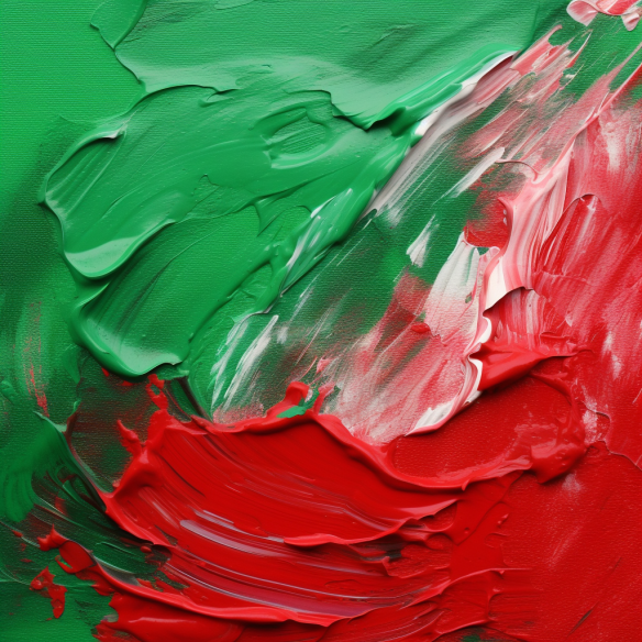
To put it simply, a color will appear more intense when placed next to its complementary color (the color that is directly opposite it on the color wheel). For example, red will appear redder when juxtaposed with green, and blue will appear bluer when placed next to orange. This contrast effect also applies to lightness and darkness – white will appear whiter next to black, and vice versa.
Furthermore, the law states that a color can induce its opposite hue in an adjacent neutral color. If a gray square is placed on a red background, the gray square may appear slightly greenish – the complementary color of red.
These principles were revolutionary at the time, and they significantly influenced the art world, particularly the Impressionist movement. Artists used Chevreul’s law of simultaneous contrast to create more vibrant and dynamic compositions. By strategically placing pure, unmixed colors next to each other on the canvas, they were able to make their paintings shimmer with light and color.
In the broader context, Chevreul’s law of simultaneous contrast has implications beyond art. It has been applied in various fields, including design, marketing, and visual communication, to create visually engaging and effective color combinations.
The Role of Light
Impressionism is inseparable from the study of light. The artists of this movement were fascinated by how the color of objects changed under different lighting conditions. They noticed that shadows were not merely darker versions of the base color but had their own hues, which could vary dramatically based on the time of day, weather conditions, or surrounding objects. This observation went against the traditional painting technique of using black or brown for shadows and highlights, which was a significant departure from the norm.
Impressionists would often paint ‘en plein air’ (in the open air) to closely observe and capture these nuances of light and color. This direct contact with nature allowed them to represent scenes more accurately, with vibrant colors and a sense of immediacy that was characteristic of the movement.
Color and Emotion
Impressionists also used color to convey emotion, a technique that was, at the time, a novel approach to painting. They recognized that color could be used to elicit specific emotional responses from the viewer. Warm colors like red, orange, and yellow were used to evoke feelings of warmth, light, and positivity, while cool colors like blue, green, and violet could elicit feelings of calm, distance, or melancholy.
The Impressionists’ innovative use of color changed the course of art history, influencing countless artists and movements that followed. They demonstrated that color was not a fixed attribute of the world, but a complex interplay of light, perception, and emotion, grounded in both the science of optics and the subjectivity of human experience. Their legacy continues to inspire and challenge artists today, reaffirming the profound impact of the science of color in Impressionist paintings.